Angular: optimize images to improve performance

Images are often make up the largest part of a page's weight. Unoptimized images can severely impact the overall performance of an Angular app but the good news is that this can be an easy thing to fix. This post provides a quick walkthrough of how to check if images are negatively effecting an app and how to make things better. There is sample code you can use to follow along with here. Follow the set up instructions in the readme.
Checking a site for performance issues
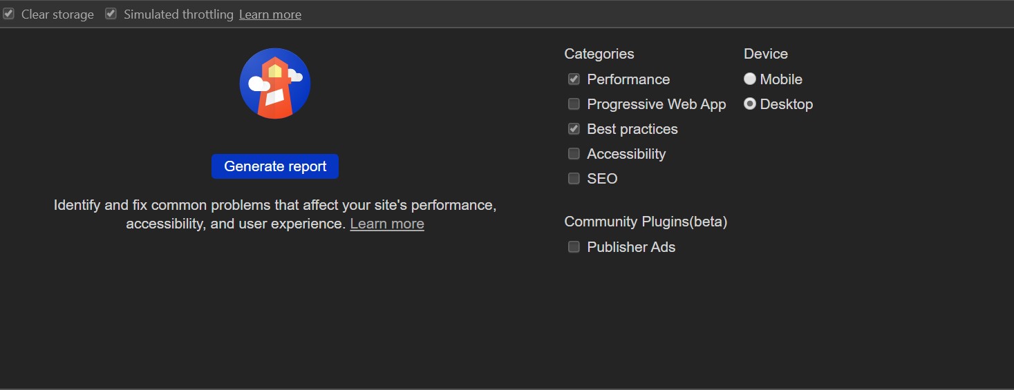
An easy way to test website performance is to run a Lighthouse report. It is also a good option as it is one of the most popular tools clients use when they want to analyze their existing site or set some benchmarks for the expected performance of a new app. To create a report: run the sample (or your own app) and in Chrome, open devtools (F12), go the Audit tab and click generate report.
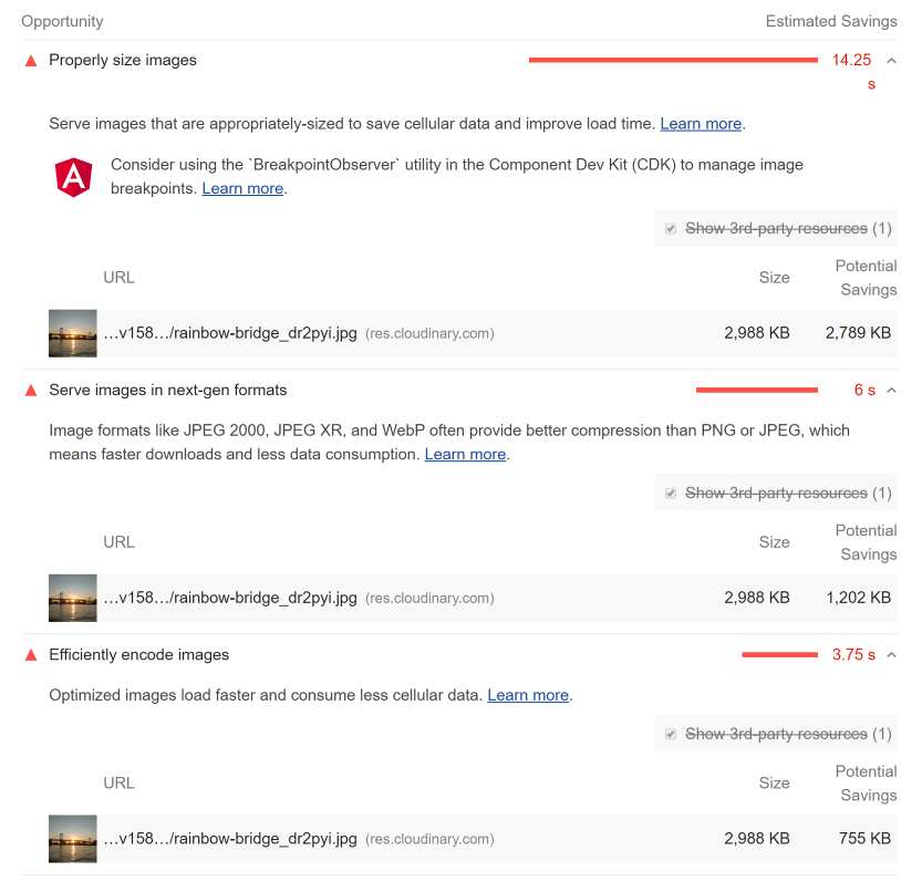
The sample app loads a 4032 x 2268px image using an img element with a max-width of 200px.
<img src="https://res.cloudinary.com/usefuldev-cloudinary/image/upload/v1580217403/rainbow-bridge_dr2pyi.jpg"
    alt="test"/>
It is a 2.9mb jpeg so it should cause some problems (opportunities) to work through.
Fixing the issues
The 3 issues relevant to this post are: properly size images, serve images in next-gen formats and efficiently encode images. To fix any of those the first step is going to be moving to a smarter way of serving images. For this the easiest approach is to let someone else do the hard work and use an image service.
Image services allow you to manipulate images as they are requested to: resize them, change formats and change the quality (among a lot of other things) If you haven't used one before three popular options are : Cloudinary, ImageKit and GraphCMS. The sample app for this post uses Cloudinary and this site itself uses GraphCMS. Essentially they work by allowing the you specify the size and format of the image in the url. Each service has it's own approach to this but they tend to follow a similar pattern. For the rest of this post we will use Cloudinary's url transformations.
# example url with resize to a width of 300px (w_300) maintaining aspect ratio
https://res.cloudinary.com/usefuldev-cloudinary/image/upload/w_300/v1580217403/rainbow-bridge_dr2pyi.jpg

# example url with file type set to webp (f_webp)
https://res.cloudinary.com/usefuldev-cloudinary/image/upload/f_webp/v1580217403/rainbow-bridge_dr2pyi.jpg
Using a picture element
Now images can be served in different sizes and formats the question is how to take advantage of that in the app. There are two native HTML options: using the img srcSet attribute or the picture element. In this post we are going to go with the picture element, not because it is better in any way but because it's more verbose syntax will come in useful later when we wrap everything into a component. Below is a picture element that has different two sets of sources for webp and jpeg formats images at different screen widths.
 <picture>
  <source
    srcset="https://res.cloudinary.com/usefuldev-cloudinary/image/upload/w_300/f_webp/v1580217403/rainbow-bridge_dr2pyi.jpg"
    media="(max-width: 599.99px)"
    type="image/webp"/>
  <source
    srcset="https://res.cloudinary.com/usefuldev-cloudinary/image/upload/w_1280/f_webp/v1580217403/rainbow-bridge_dr2pyi.jpg"
    media="(min-width: 1280px) and (max-width: 1919.99px)"
    type="image/webp"/>
  <source
    srcset="https://res.cloudinary.com/usefuldev-cloudinary/image/upload/w_1920/f_webp/v1580217403/rainbow-bridge_dr2pyi.jpg"
    media="(min-width: 1920px)"
    type="image/webp"/>
  <source
    srcset="https://res.cloudinary.com/usefuldev-cloudinary/image/upload/w_600/f_webp/v1580217403/rainbow-bridge_dr2pyi.jpg"
    media="(min-width: 600px) and (max-width: 959.99px)"
    type="image/webp"/>
  <source
    srcset="https://res.cloudinary.com/usefuldev-cloudinary/image/upload/w_960/f_webp/v1580217403/rainbow-bridge_dr2pyi.jpg"
    media="(min-width: 960px) and (max-width: 1279.99px)"
    type="image/webp"/>
  <source
    srcset="https://res.cloudinary.com/usefuldev-cloudinary/image/upload/w_300/f_jpg/v1580217403/rainbow-bridge_dr2pyi.jpg"
    media="(max-width: 599.99px)"
    type="image/jpg"/>
  <source
    srcset="https://res.cloudinary.com/usefuldev-cloudinary/image/upload/w_1280/f_jpg/v1580217403/rainbow-bridge_dr2pyi.jpg"
    media="(min-width: 1280px) and (max-width: 1919.99px)"
    type="image/jpg"/>
  <source
    srcset="https://res.cloudinary.com/usefuldev-cloudinary/image/upload/w_1920/f_jpg/v1580217403/rainbow-bridge_dr2pyi.jpg"
    media="(min-width: 1920px)"
    type="image/jpg"/>
  <source
    srcset="https://res.cloudinary.com/usefuldev-cloudinary/image/upload/w_600/f_jpg/v1580217403/rainbow-bridge_dr2pyi.jpg"
    media="(min-width: 600px) and (max-width: 959.99px)"
    type="image/jpg"/>
  <source
    srcset="https://res.cloudinary.com/usefuldev-cloudinary/image/upload/w_960/f_jpg/v1580217403/rainbow-bridge_dr2pyi.jpg"
    media="(min-width: 960px) and (max-width: 1279.99px)"
    type="image/jpg"/>
  <img src="https://res.cloudinary.com/usefuldev-cloudinary/image/upload/v1580217403/rainbow-bridge_dr2pyi.jpg" alt="test"/>
</picture>
The order of the sources is important for the image formats. The browser will use the first format it supports. For Chrome that will be webp, which has better compression than jpeg. If the browser doesn't support webp (Safari for instance) it will fall back to the jpeg sources. If it is an old browser that doesn't support the picture element (IE) then it will just render the img element. So this just improved the app performance massively but it would be painful to do this manually for every image. Luckily the format of the element lends itself nicely to being encapsulated in a component with an ngfor for the image formats and another nested one for the media queries. If you want to see an example have a look at the app-picture component in the sample
Using ngx-picture
Rather than creating a custom picture component we are going to use an existing library called ngx-picture. It takes a small amount of setup using the default Cloudinary config.
...
import { CLOUDINARY_CONFIG, NgxPictureModule } from 'ngx-picture';

@NgModule({
  declarations: [
   ...
  ],
  imports: [BrowserModule, NgxPictureModule.forRoot(CLOUDINARY_CONFIG)],
  providers: [],
  bootstrap: [AppComponent]
})
export class AppModule {}
After that instead of having to type out picture elements the ngx-picture can be used to render the same markup with much less effort.
<ngx-picture
  src="https://res.cloudinary.com/usefuldev-cloudinary/image/upload/v1580217403/rainbow-bridge_dr2pyi.jpg"
  alt="rainbow bridge"
  [lazyLoad]="true"
></ngx-picture>
Deferring offscreen images
A final way to tweak image loading to improve page loading is to defer the loading of any images that the user cannot see (usually because they are off screen and have to be scrolled into view). There is a loading attributeon the img element that can be set to lazy to enable built in browser deferred image loading. Unfortunately the browser support for this is not wide spread. The ngx-picture component has a lazy-load which when set to true will use an IntersectionObserver to detect if an image is in view and then load it. If your app has any kind of news feed design this can provide a huge performance improvement.